Assignment 1 - Extract UI Items

Image of the nav bar where the button is depressed.
Depressed Nav Links

jekyllrb.com - UI Navbar

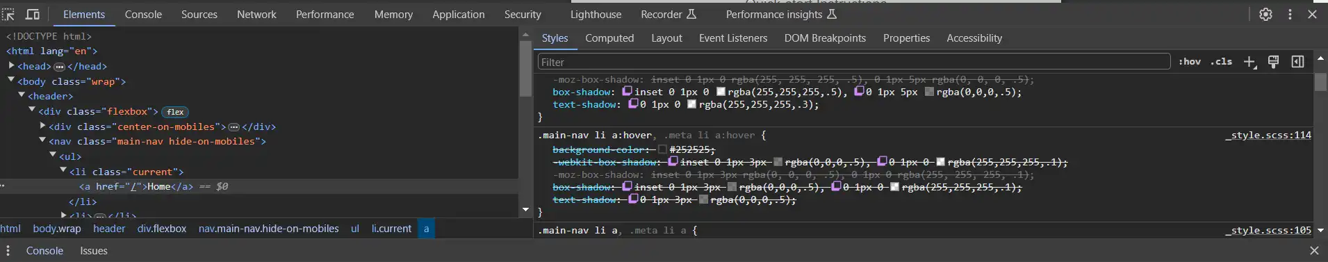
UI NavBar Item - Summary

This UI navigation item is unique. On hover, the navigation link looks depressed. Its a small detail, but I really like the way it looks! It also helps show the user which link they are looking at.

UI NavBar Links- Techniques

The designer used a slighty darker background color along with a box-shadow. The box shadow used a darker yet color at the top of the box with an inset border to give the impression that the link is pushed down. The same technique is used on the font in the link name to give a slight change in look.

Image of the red lines that seperate categories.
Red Divider Lines

jekyllrb.com - UI Red Dividers

Red Divider Lines - Summary

The red lines divide the content in the aside. It gives a nice seperator to each section.

Red Divider lines- Techniques

The technique the designer used is pretty simple, yet gives a nice look. All they did was add a bottem border, made it 1 pixel and solid red. Then they attached it to the article with a negative 30 pixel margin-left. This was there isnt a gap between the article and where the aside starts. It makes the whole appearance of the page tie in together.

Image of the 3D ribbon.
Red 3D Ribbon

jekyllrb.com - UI 3D Ribbon

Red 3D Ribbon - Summary

The addition of the small triangle above the red ribbon give the ribbon a 3D look. Again its a small detail that the designer added to make the website "fun".

Red 3D Ribbon - Techniques

The technique used just adds a small triangle to the red ribbon. To create this the designer shaped the border "triangle" by calling colors in 4 different locations in the border-color attribute. Two colors are a shade of red to match the ribbon and a little darker to give the affect of being behind the ribbon. Then they used the body color to shape the 3D affect. After that a top margin was given of -10 to line up the border with the top of the red ribbon. The position of "absolute" allows the border to be placed at the beggining of the ribbon.

Image of the arrow that points to the current section.
Arrow Pointer

jekyllrb.com - UI Arrow

Arrow Pointer - Summary

The arrow pointer is used to show the user the link they are currently looking at. Its a great UI/UX tool to use so the user doesnt have to guess where they. I like the use of it from an ease of use stand point.

Arrow Pointer - Techniques

Like the previous 3D Ribbon, the designer used a border attribute to create a small triangle. On three sides they used a clear color while on the fourth side they used the same gray from the article. Using a margin-left or -30 pixels allows the arrow to line up with the edge of the article. A border-width of 10 pixels gives the arrow its size. The class of "current" attaches the arrow to the link that has been clicked. That is how it changes between all of the links to the current link.